FREELANCE PRODUCT DESIGNER
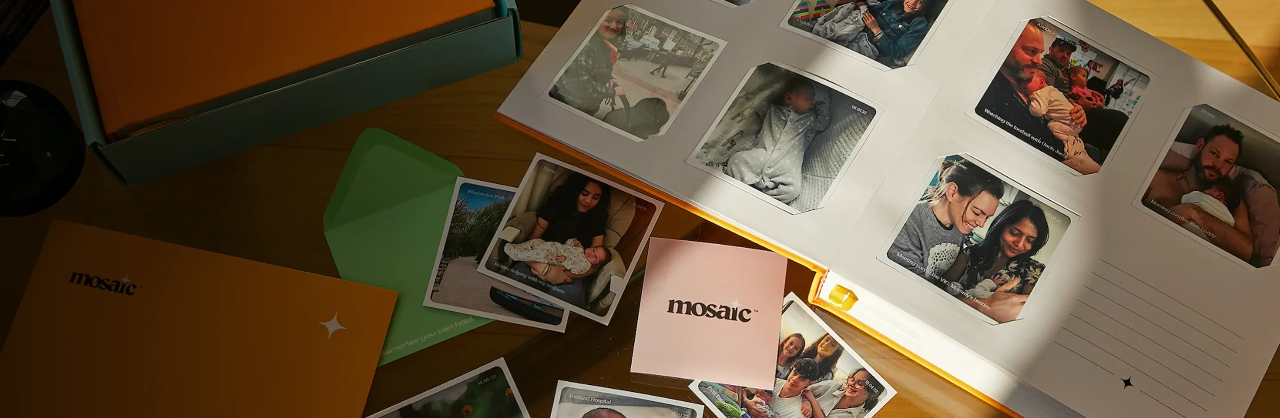
MOSAIC JOURNAL
Design the onboarding & activation experience
PROJECT GOAL
My RoleFreelance UX/UI Designer
ToolsFigma
App launched in 8 countries, investment secured on Dragon’s Den (Stephen Bartlett invested)
ResultsRequirements gathering through to ideation & definition and design
ProcessPROBLEM DEFINITION
Help establish a new onboarding process, encouraging users to sign up for a monthly photo subscription.
DISCOVERY
Client Meeting
I started with a client meeting to further understand their requirements.
Free Photos
The client wanted all users to get their first month's worth of photos for free.
Set up a Subscription
A checkout flow was critical so that users could pay for their subscription.
Account Creation
There had to be a secure way for the user to set up their account.
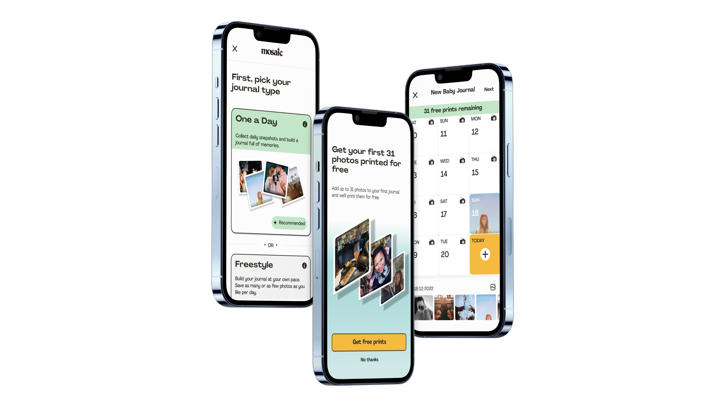
Support One a Day and “Freestyle”
Users can choose between uploading one photo a day or uploading whenever they wanted.
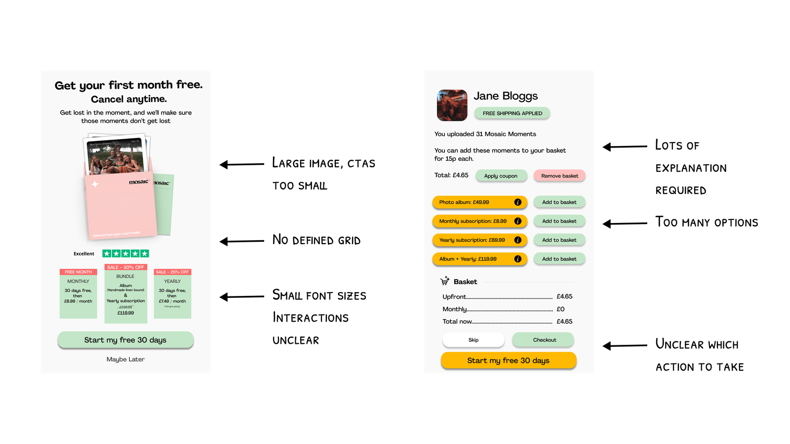
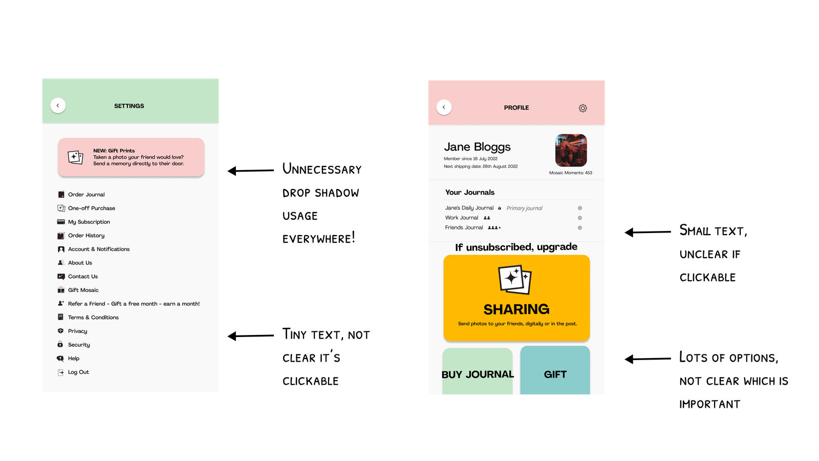
Evaluating the Existing Design
The client had prepared an initial draft of the design, which I reviewed thoroughly and used as a starting point for discussions to clarify their specific goals and desired outcomes before planning the next steps.
DEFINITION
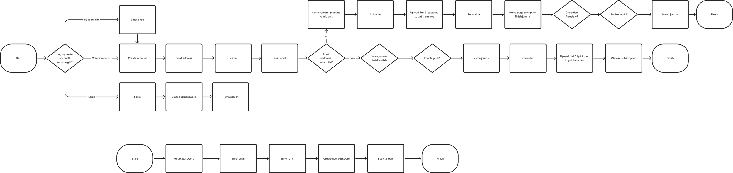
New User Flows
Collaborating closely with the founder to prioritise key flows, I began developing user journeys with a focus on ensuring that every new user received their free photos. Initially, the client envisioned that users would unlock a free month of prints upon signup. However, this raised several questions:
What if they chose not to subscribe afterwards?
If they joined during a short month, how many photos would they actually receive?
Would unused photos carry over to the next month?
By creating detailed user flows and mapping out various scenarios, we ultimately agreed on a more streamlined approach: an onboarding interstitial that would allow all users to upload and order 31 free prints after signing up for a subscription.
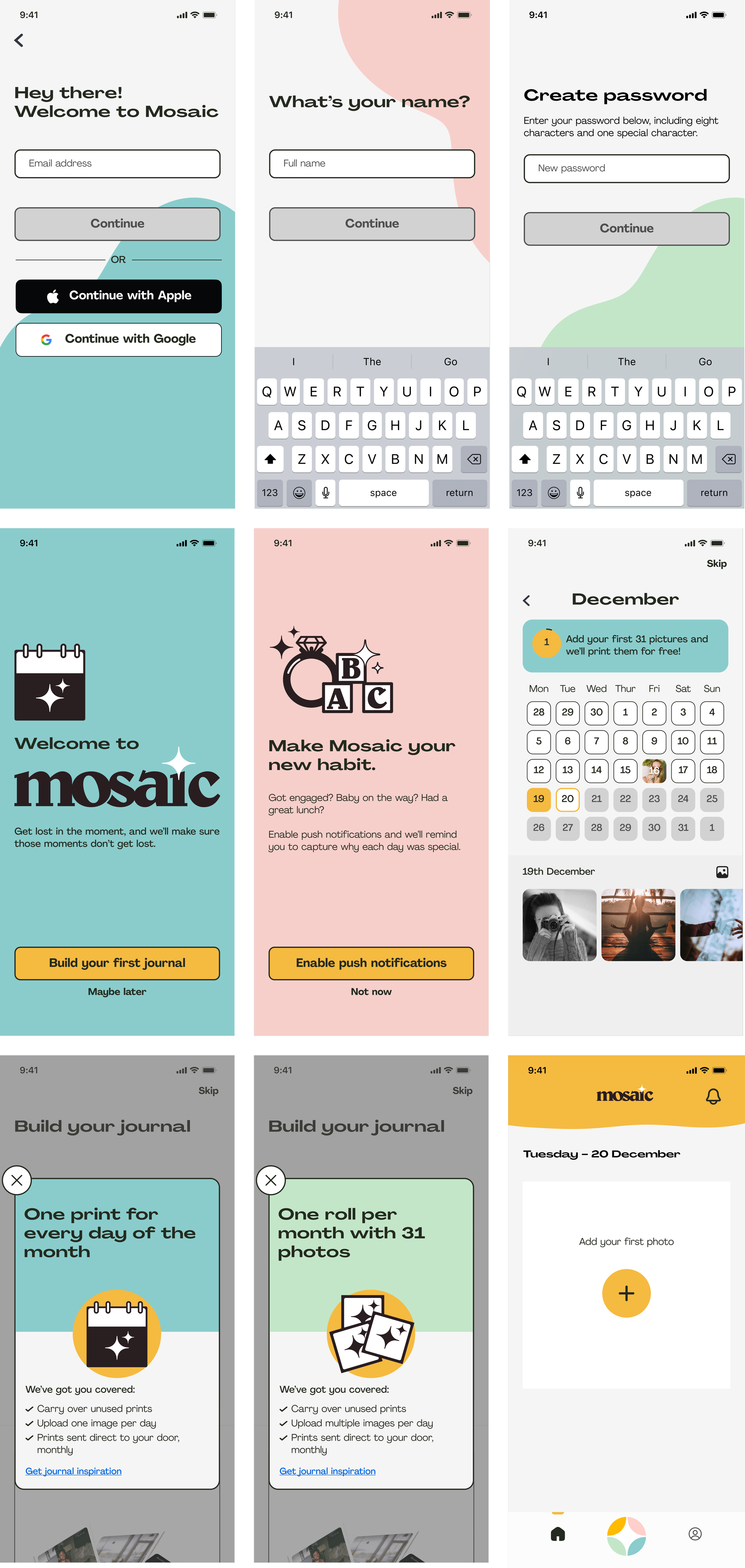
I began creating the flows, incorporating the brand colours to bring the client's vision of a fun, friendly brand to life. I started concept sketching, using their illustrations in a more prominent way—unlike the initial design, which had reduced them to small, icon-like elements that didn’t showcase their full appeal. While the client was initially hesitant about the bright colour accents, they appreciated the bold outlines around CTAs and input fields, signalling a need to refine the design further.
I iterated on my initial designs and incorporated feedback from the client to achieve a final visual direction which covered all of the important scenarios and enabled an MVP build. The client was very satisfied with the end result and Mosaic Journal is now live in eight countries across the world.
DEVELOP
New Design - First Iteration
Defining a new aesthetic
Final Designs
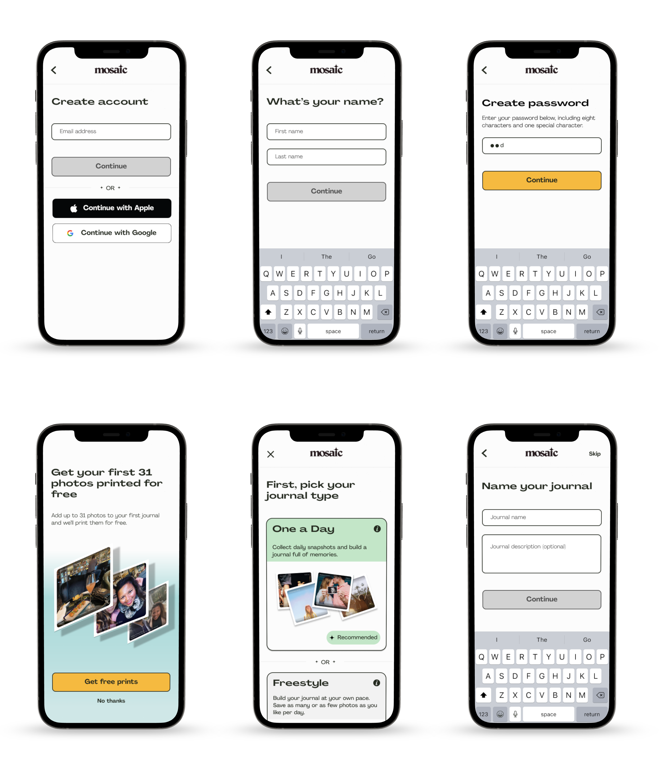
Onboarding and Journal Set Up
Calendar View and Photo Upload
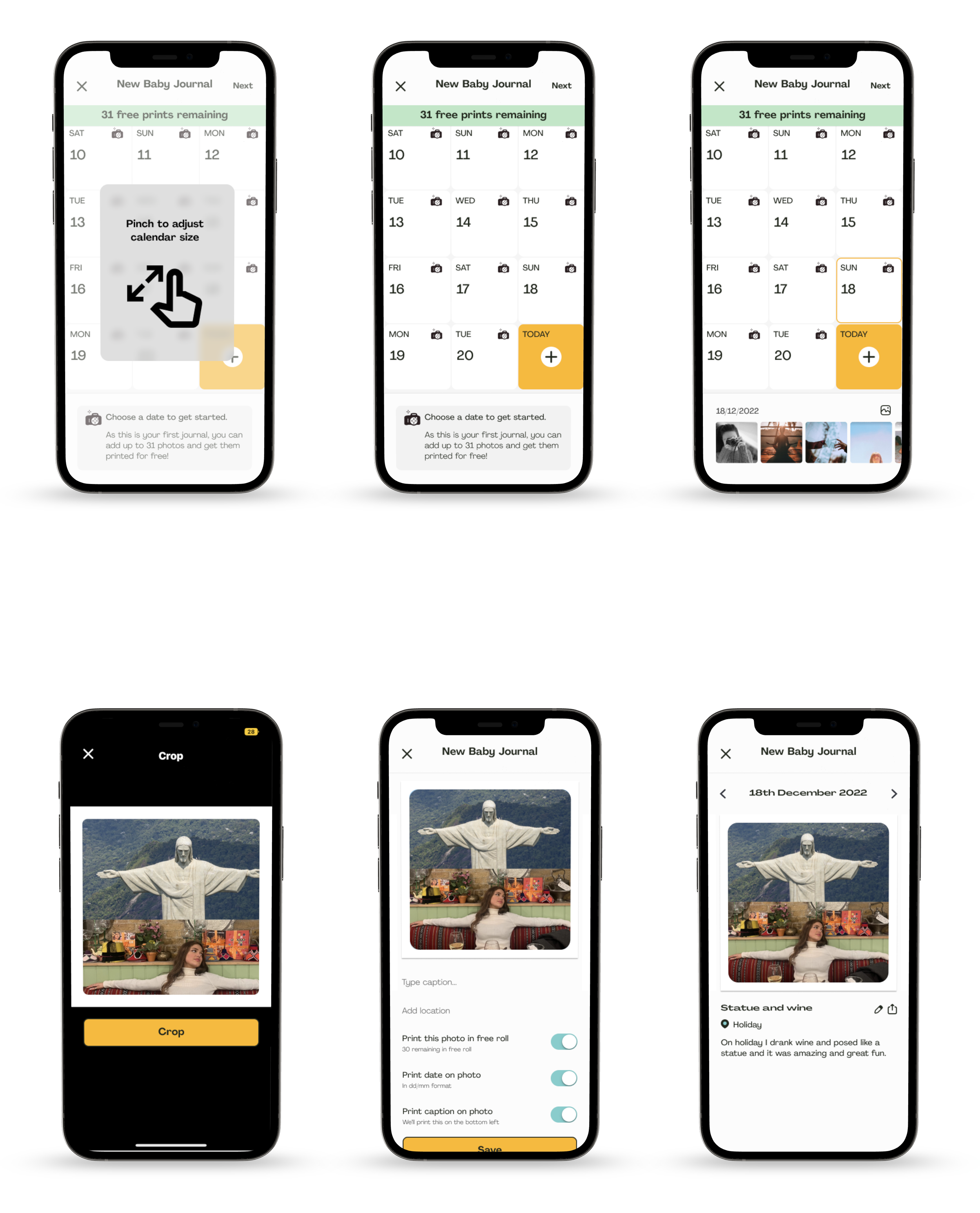
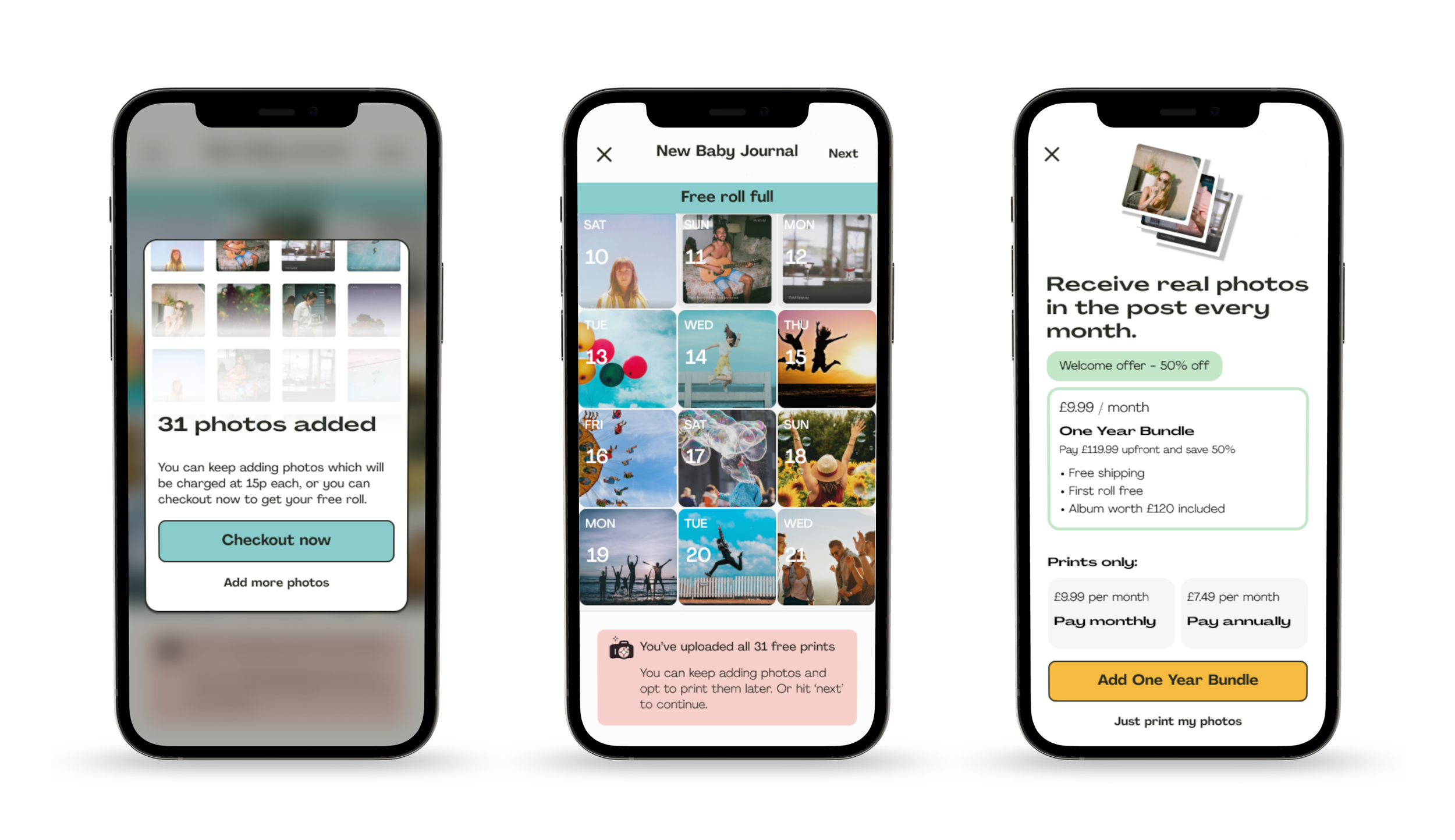
Complete Free Photo Interstitial and Subscribe