FREELANCE PRODUCT DESIGNER
ACTIONAID
Encourage younger audiences to become regular monthly donors through an engaging digital experience.
PROJECT GOAL
My RoleFreelance UX/UI Designer
ToolsFigma, Figjam, Ballpark
Successful usability testing, concept taken into build
ResultsDiscovery through to ideation & definition, design and testing
ProcessPROBLEM DEFINITION
ActionAid is a global charity working with women and girls living in poverty, however, recurring, monthly donations are in decline.
DISCOVERY
Client Meeting
I started with a client meeting to further understand their requirements.
Attract new donors
Typical donors were women in their 50s. ActionAid wanted a new audience.
Small budget for build
ActionAid was budget conscious and wanted an affordable solution.
Mobile first
The majority of donations were made through mobile devices.
Focus on regular giving
This had to be a feature that encouraged ongoing monthly donations.
User Interviews
After completing a screener survey, 30 participants were selected for 1:1 interviews.
KEY INSIGHT ONE
👯♂️
Personal Connection
People were most motivated to donate to charities that resonated with them personally.
KEY INSIGHT TWO
🤑
Affordability
Committing to monthly donations was a concern to some users as they worried about how much they could afford to give.
KEY INSIGHT THREE
🌍
Impact
Those who did donate were motivated by seeing the impact that their money could have.
KEY INSIGHT FOUR
🤝
Community
People wanted to feel like they were part of something.
DEFINITION
How might we…
…make recurring donations feel more affordable?
…increase a sense of personal connection for donors?
…foster a sense of community?
…show the impact of contributions?
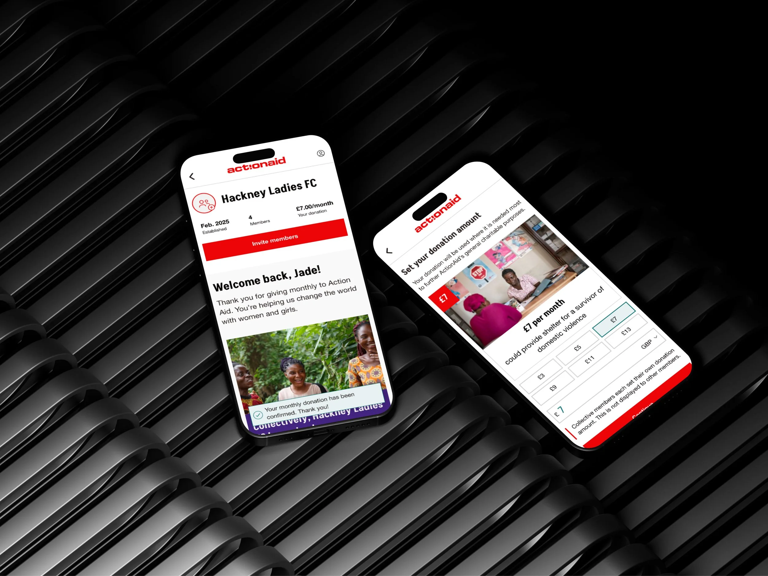
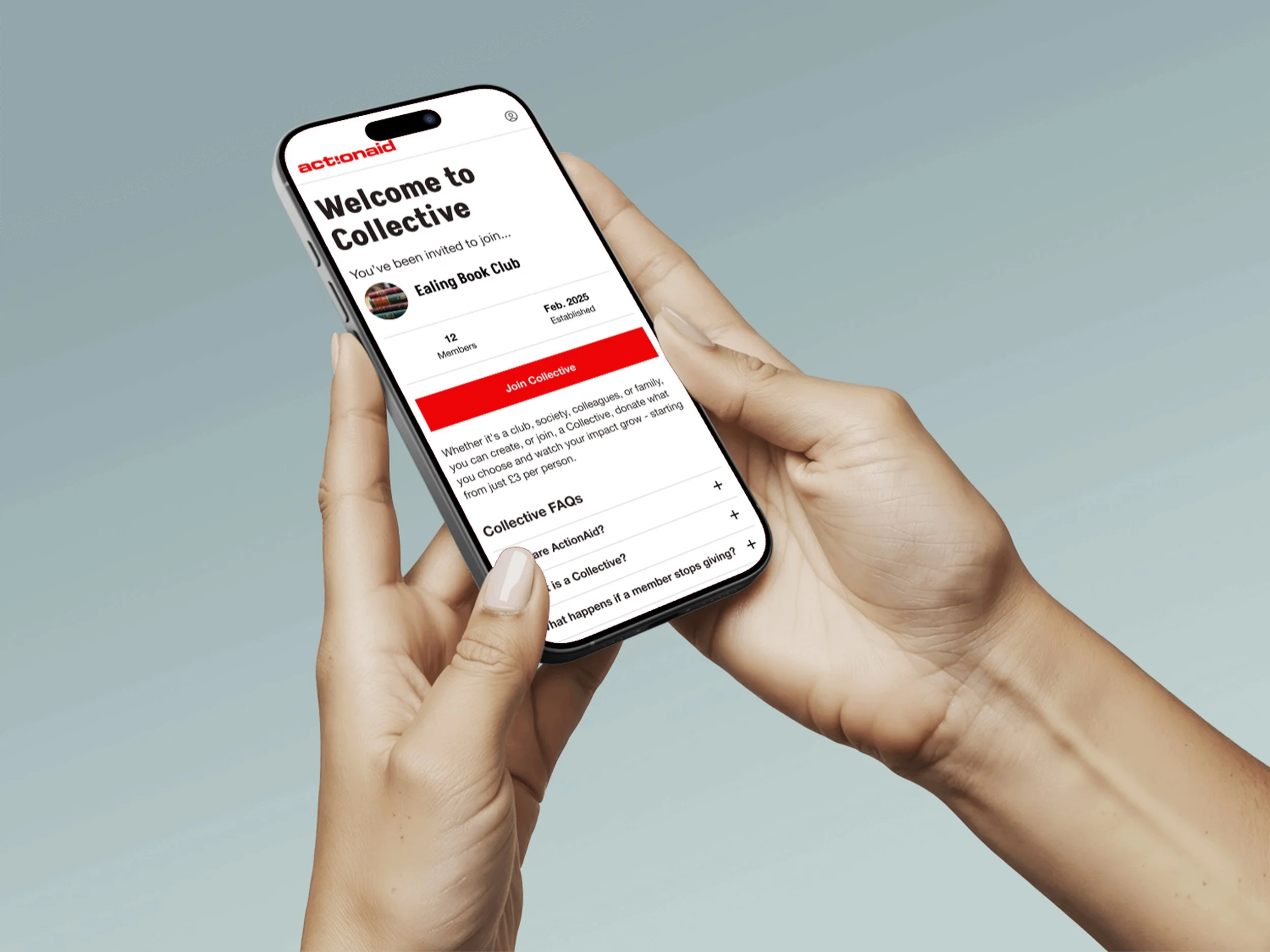
Groups of people who know each other can set up a donation group, club together and give small amounts which collectively add up.
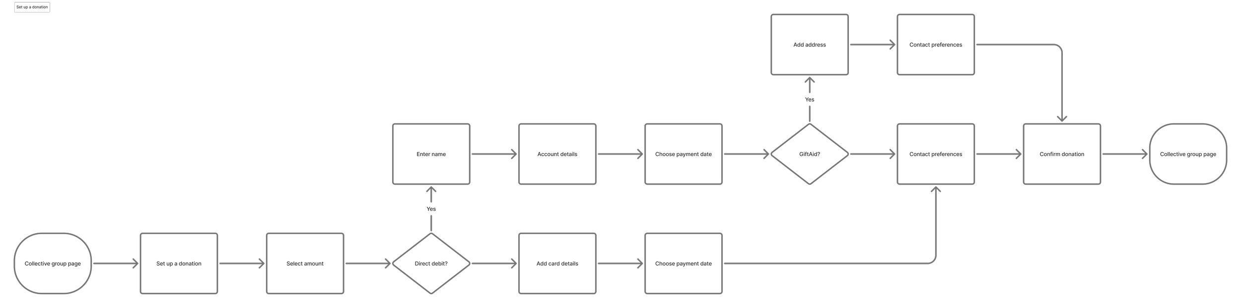
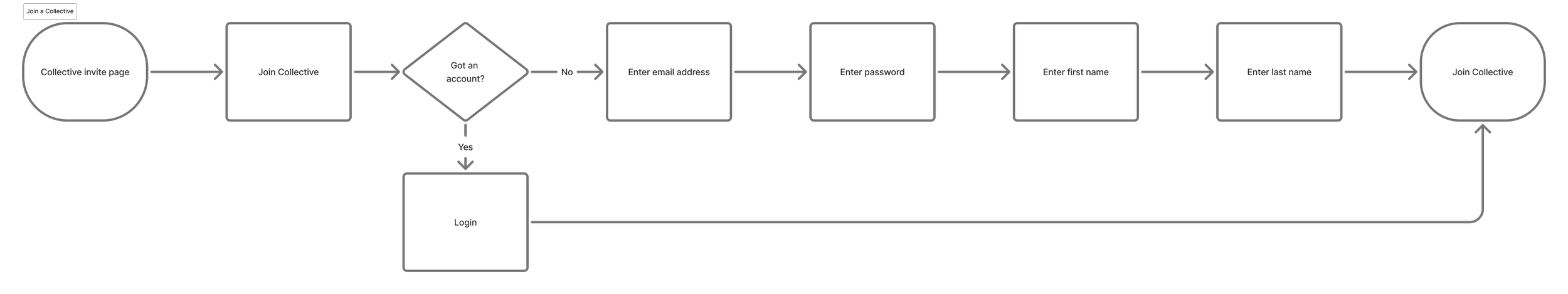
The core flows would allow users to:
Create a group and start contributing monthly.
Invite others to join and add their contributions.
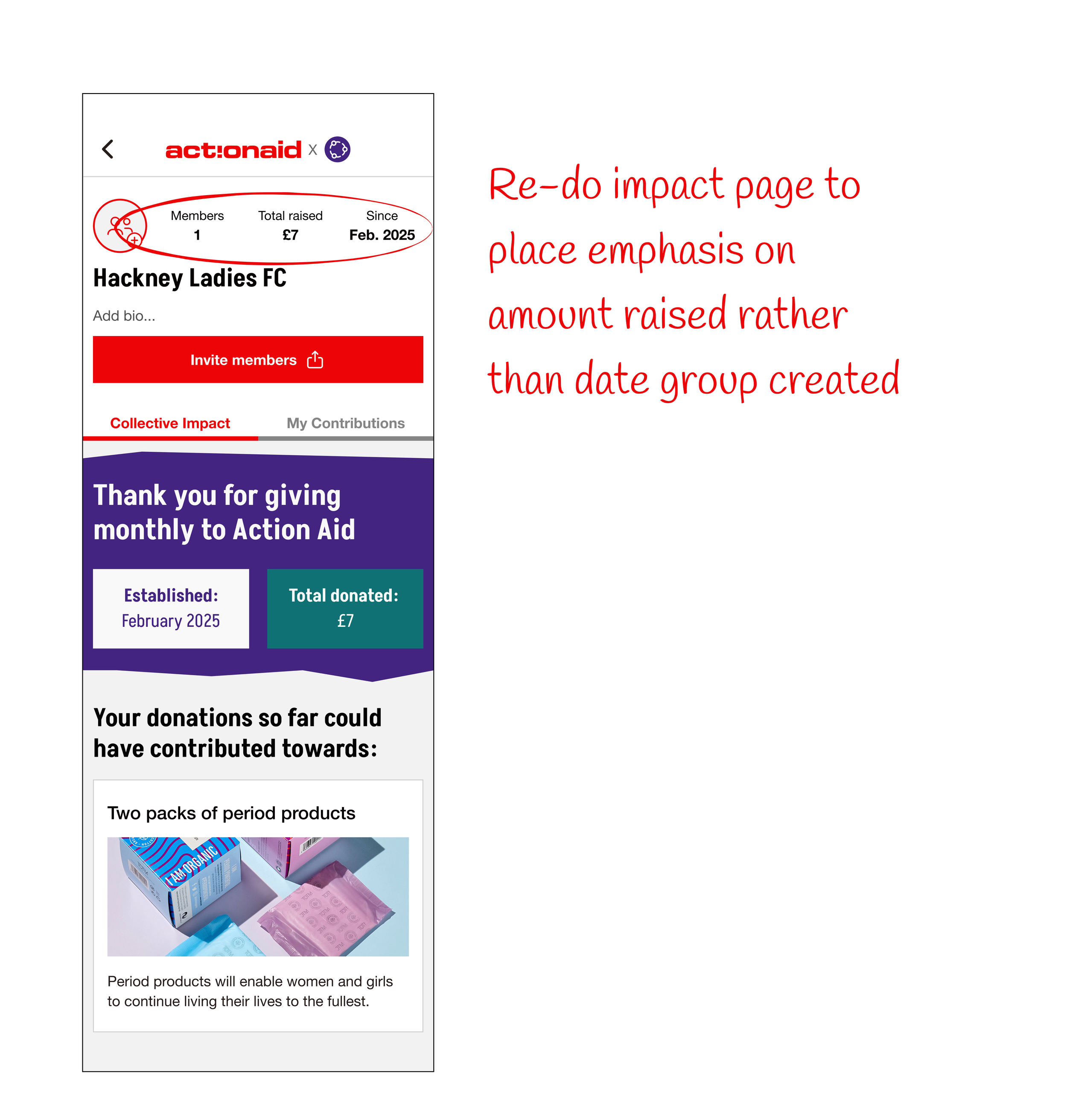
Show the impact of the group’s Collective over time.
DEVELOP
The Solution
Group Donations through “Collectives”
DELIVERY
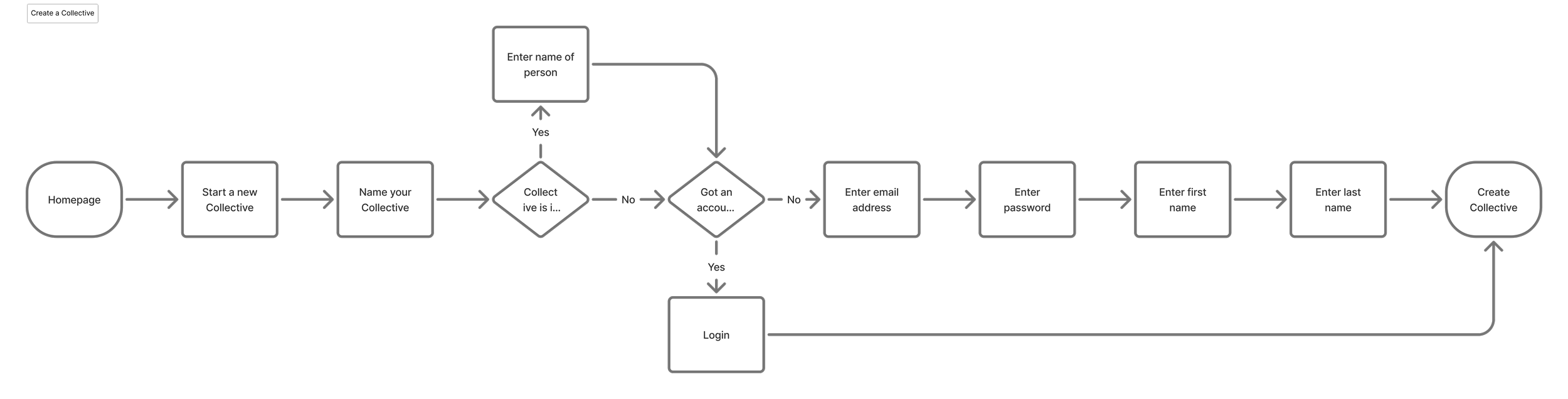
Key User Flows
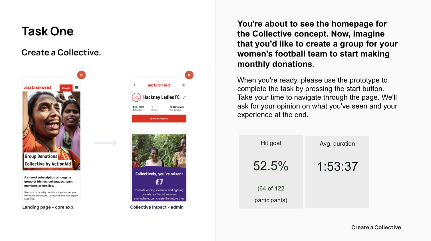
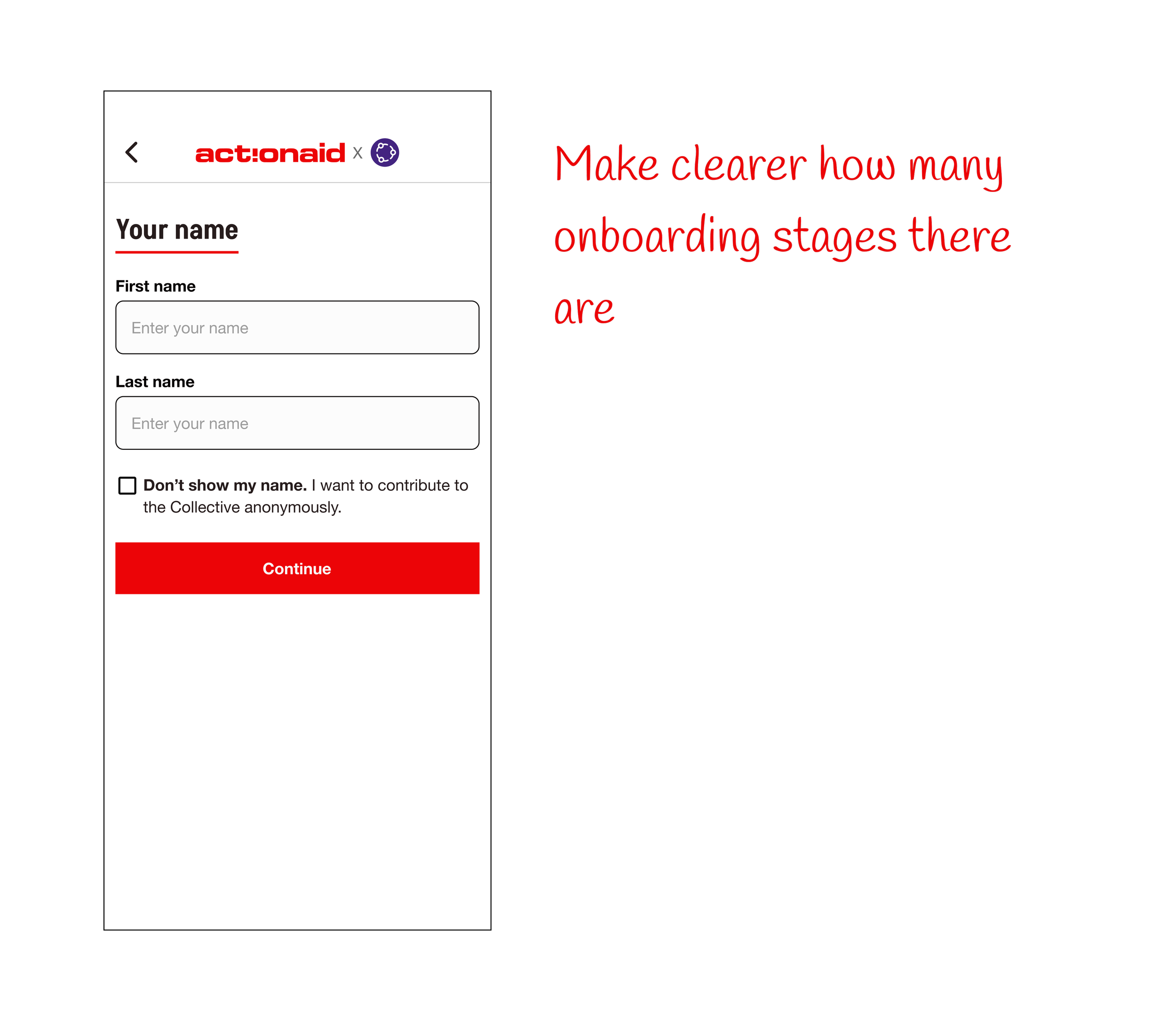
Create a Collective
Set up a donation
Join a Collective
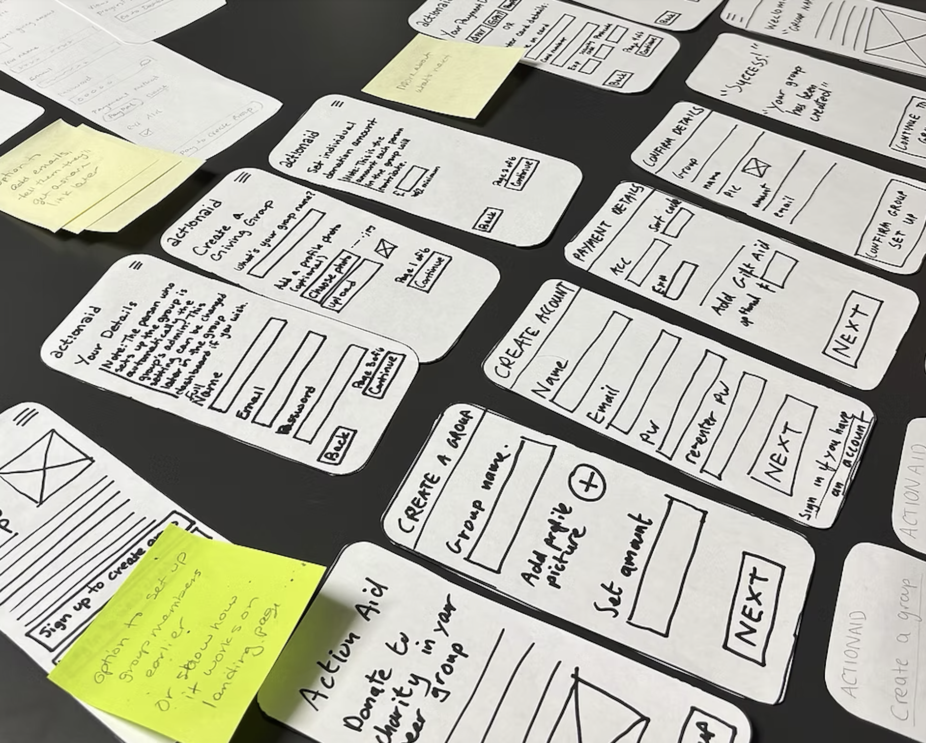
Initial Concept Testing
I tested the initial concept using Ballpark.
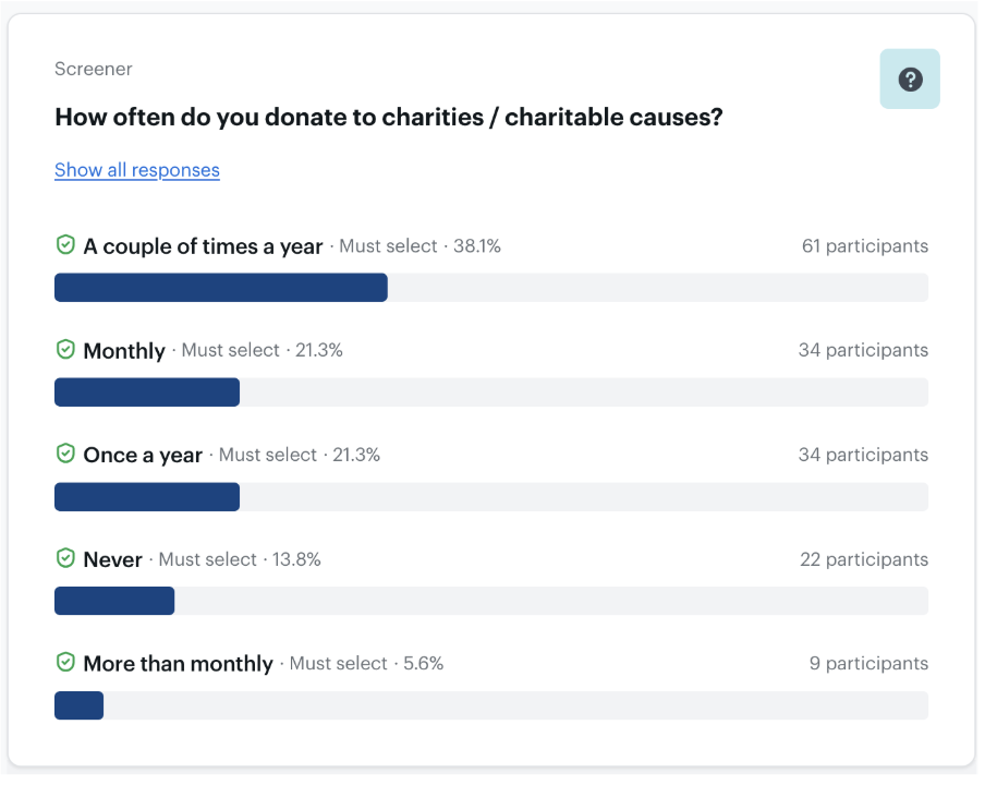
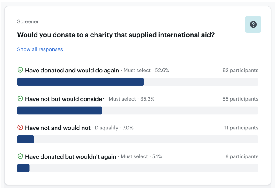
184 participants went through the screener with 143 qualifying to take part in the research.
Results
The results from the Ballpark usability test were positive overall. They allowed me to iron out obvious design changes before proceeding into the next round of testing - face to face usability testing.
Sentiment Analysis
Positive Comments:
"Love the concept" / "Great idea" / "Excellent idea" / "Amazing idea!"
"Easy to navigate"
"If I know my friends are also contributing, it might encourage me to donate"
Negative Comments:
"Confusing coming cold to it"
"It took a minute to understand what it was/the benefit"
Positive Comments:
Many users found the process easy, intuitive, and straightforward.
Several users appreciated the simplicity and clarity of the flow.
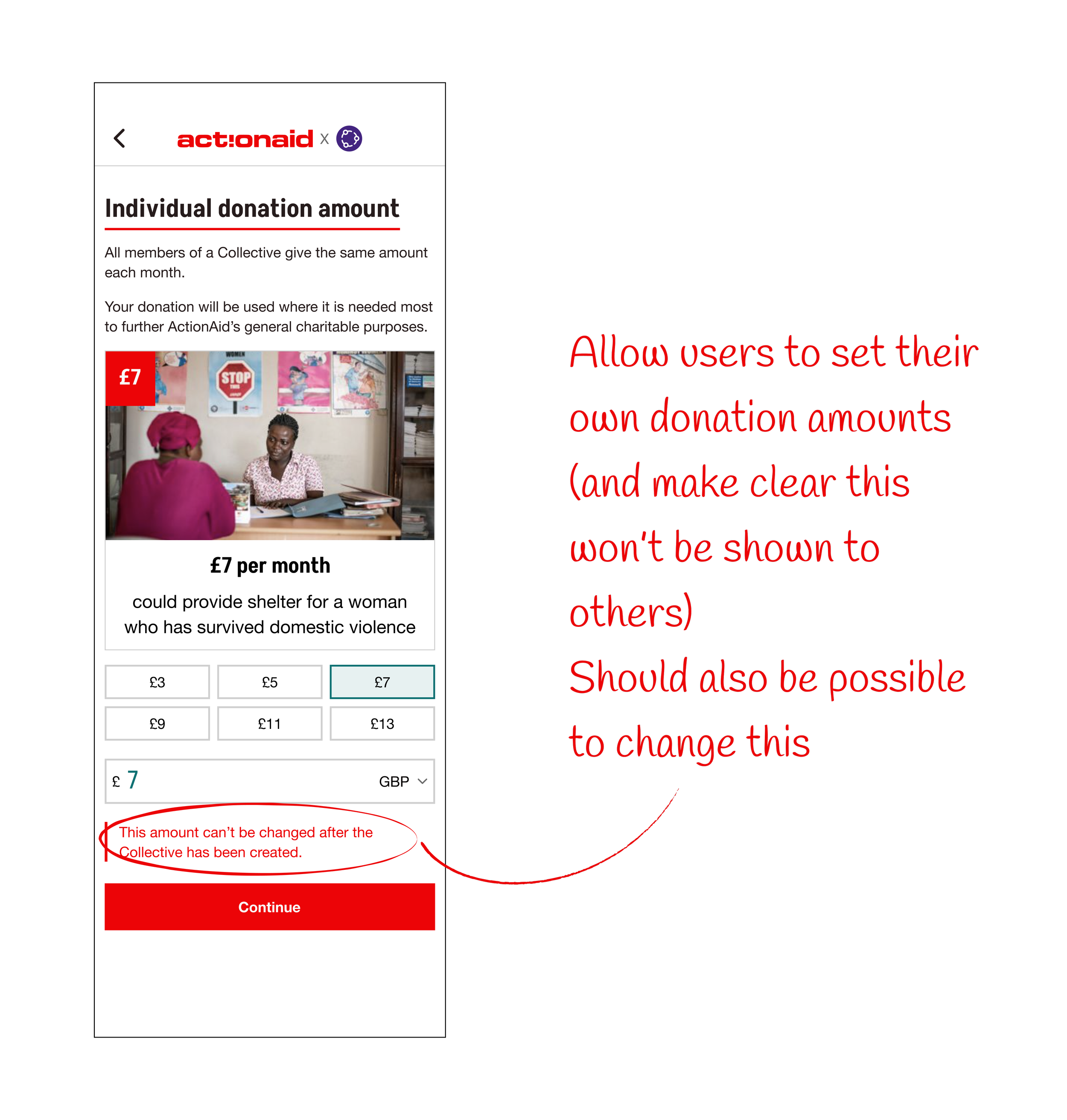
"It seemed easy to follow and I like the feature to hide the contributions to the other members."
Negative Comments:
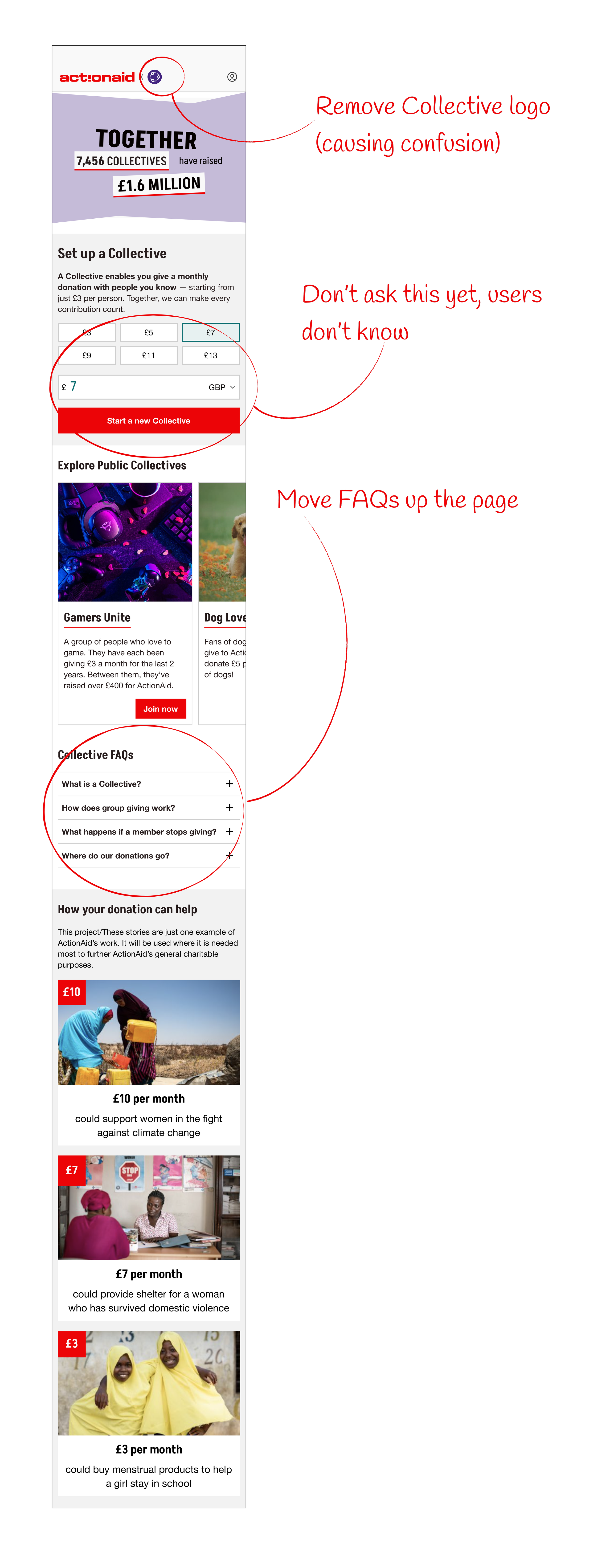
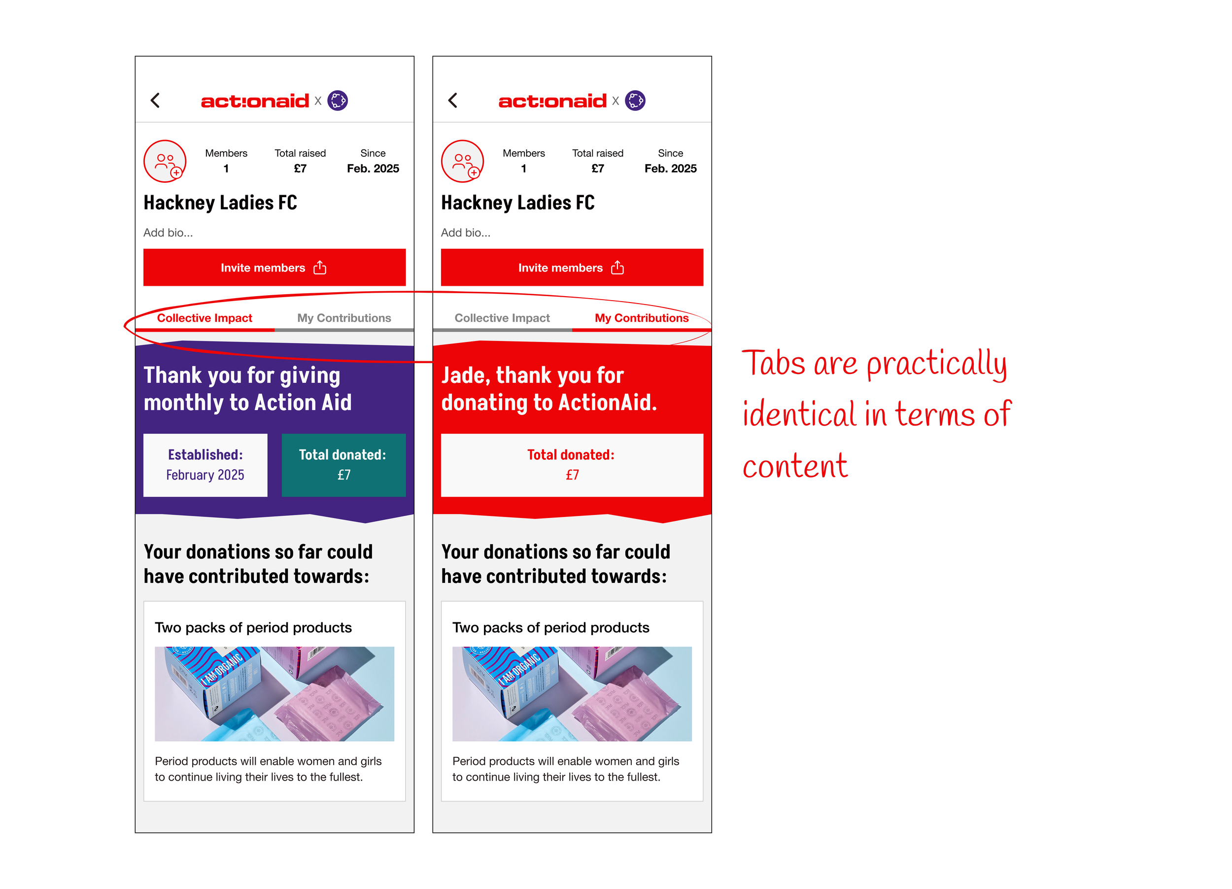
"Not the way I anticipated - I'd rather build the Collective then think about the amount we are trying to raise."
"It was confusing if I was setting an amount our collective would pay monthly or if I was starting the group donation with £7 for myself."
"I found it a little hard to follow... I was looking for a button that would let me set up a Collective/group."
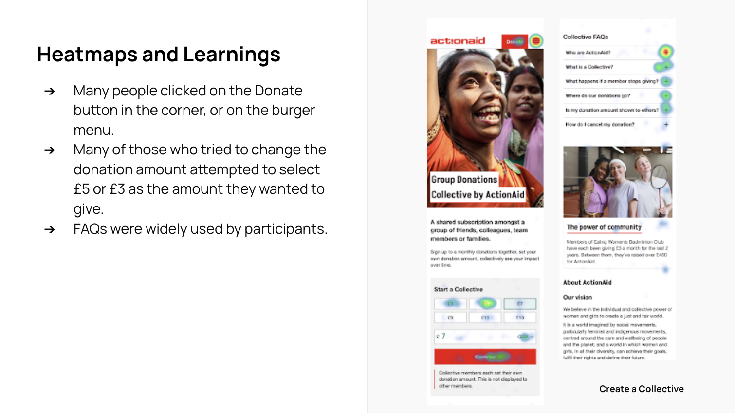
Usability Testing
I enhanced the flow and then ran two further rounds of usability testing, with a total of 12 participants.
✅ Concept appeal: Many participants found the idea of group donations engaging and community-oriented. It was seen as a potentially effective way to encourage regular giving.
✅ Clarity: The concept was generally well-explained, with participants appreciating the clear information provided about the collective's purpose and financial contributions.
✅ Social aspect: The community feeling and ability to give with friends or family was seen as a strong point.
✅ Ease of use: Participants appreciated the straightforward process of setting up and joining a collective.
Positive Feedback:
Final Designs
Create a Collective
Join a Collective